Target Acquired: What a Heat Map Sees That a Spreadsheet Can't
Sequel to the ads piece. The heat maps came back and found the next two bottlenecks, and neither would have shown up in a spreadsheet. On mobile, people were tapping the copy at the top of our booking page and never reaching the dates below it, because thumbs live in the top third of the screen. On desktop only, people were clicking our bright cyan headlines because they looked like links. Same data, two completely different levels of understanding. A number tells you that something is wrong. A picture tells you where.
Quick recap for anyone who missed the last one. I spent $300 on ads, found three bottlenecks in two days, and ended the article saying I was still waiting on results from the calendar fix. Sixty people had tapped the button to book a call. One made it through.
The heat maps came back. We found the next two bottlenecks. And this is the part that made me want to write a sequel: neither of them would have shown up in a spreadsheet. Not in a thousand rows. The numbers were all there and the numbers could not have told me.
So this one's about why seeing your data is a completely different act than reading it.
A number tells you that. A picture tells you where.
Here's the whole thesis in one line. A spreadsheet can tell you something is wrong. A picture can tell you where it's wrong. And "where" is the only part you can actually fix.
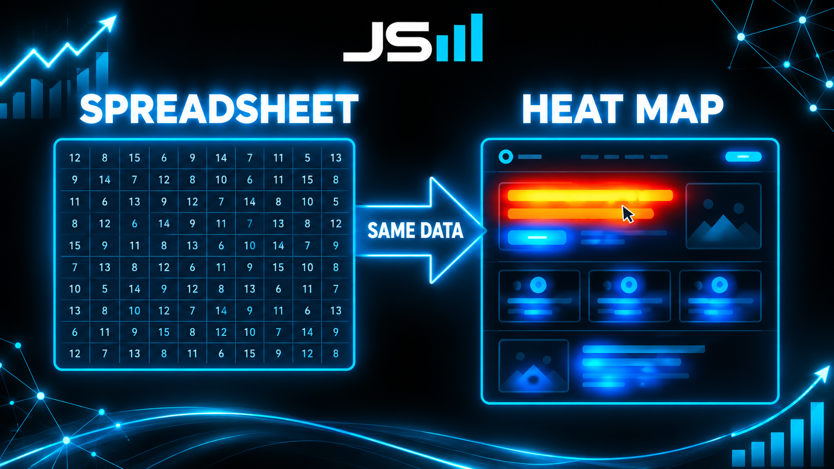
"60 taps, 1 booking" is a spreadsheet fact. It's a good fact. It sent me to the calendar. But once I was standing in front of the calendar, the number had nothing left to say. It couldn't tell me which part of the page people were touching, or which part they never reached, or whether they were confused or bored or just holding the phone the way humans hold phones. For that I needed to look at the page the way a visitor saw it, with their fingerprints still on it. That's what a heat map is. It's the page with the fingerprints left on.
Bottleneck four: thumbs live in the top third
Here's the rebuilt calendar page, heat map on. This is the exact screen those 60 people landed on.
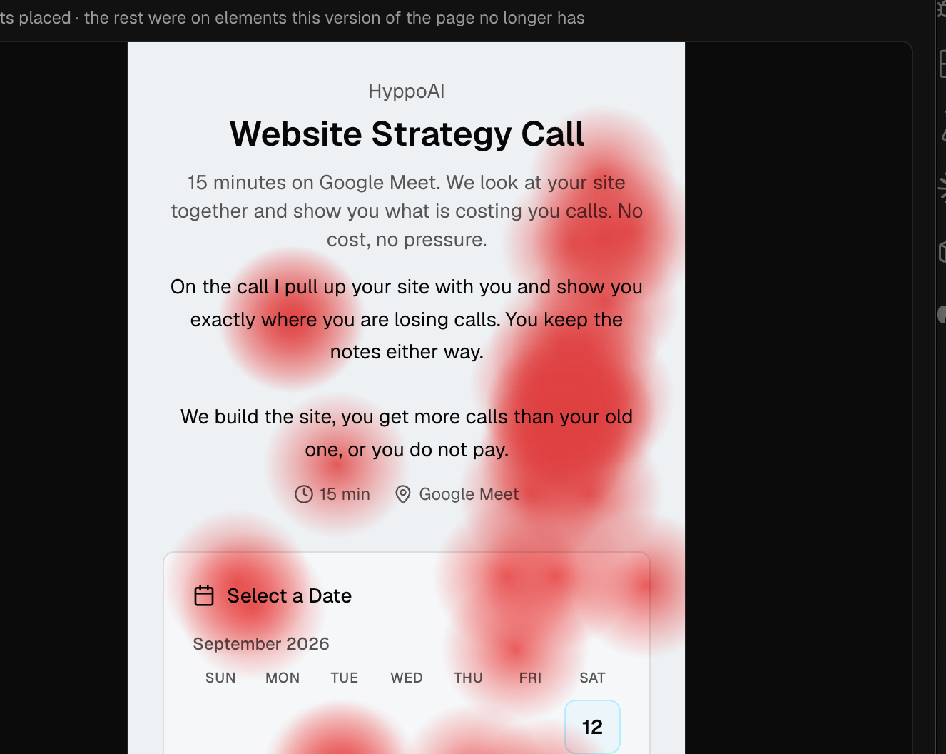
The red marks are where people tapped. They're all over the copy at the top. "Pull up your site." "Where you are losing calls." People were tapping sentences. Sentences don't do anything.
Meanwhile the thing we actually wanted them to touch, the date picker, is sitting lower down the screen in a cold, quiet zone with almost no marks on it.
My first read was that people were confused by the copy. Wrong. The real answer is dumber and much more useful: on a phone, people tap the top third of the screen. That's where the thumb rests. That's where attention goes first. It doesn't matter what you put there, that's where the fingers land. We had put words there and dates below, so people tapped words and never got to dates.
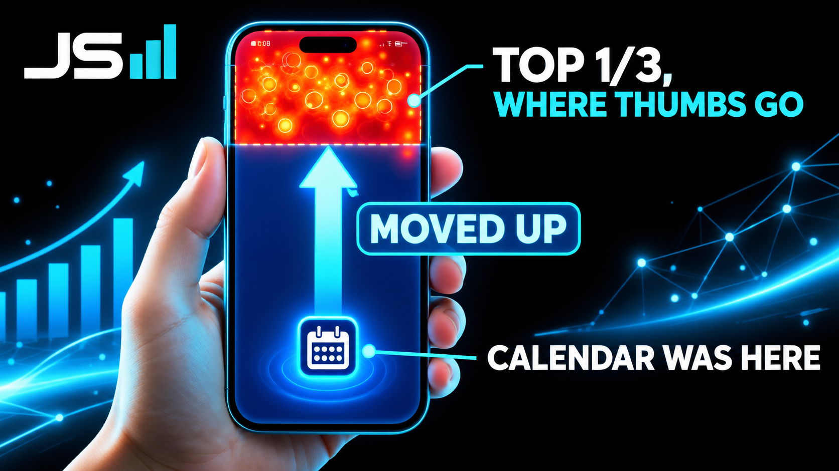
So we're redesigning the calendar. Dates move up into the zone where thumbs already are. The explanatory copy gets shorter and moves down, or goes away, because the person tapping already read the landing page and already decided. They don't need to be sold again. They need a date within reach of their thumb.
You could stare at "60 taps, 1 booking" for a year and never arrive at "move the calendar up three inches." The picture got me there in about four seconds.
Bottleneck five: our own brand color was lying to people
This one's funnier, and it only showed up on desktop.
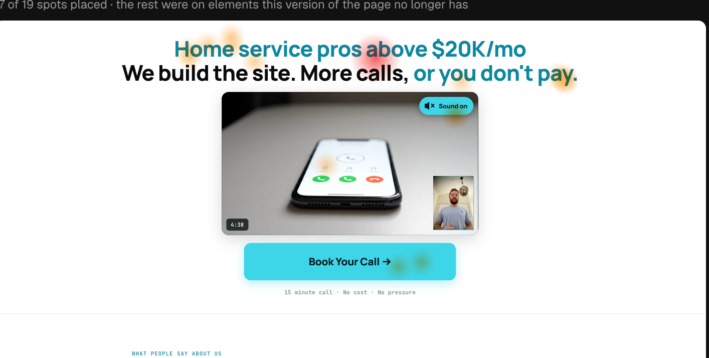
Look at the marks on the headline. "Home service pros above $20K/mo." People on desktop were clicking it. Repeatedly. It isn't a link. It doesn't go anywhere. It's just a headline.
Here's why. Our brand color is a bright electric cyan. It's on everything we make, it's on this website, I love it. And on a desktop screen, a short line of bright cyan text sitting on a dark background looks exactly like a hyperlink. Twenty-five years of the internet have trained every human with a mouse that blue-ish text is clickable. So they clicked it, nothing happened, and some percentage of them assumed the page was broken and left.
On mobile this never showed up. No cursor, no hover state, no lifetime of habit telling your thumb that colored text is a door. Same page, same color, completely different behavior depending on the device. If we'd looked at one blended number for "clicks on headline," we'd have seen a small weird blip and moved on. Split by device, the desktop half lit up red.
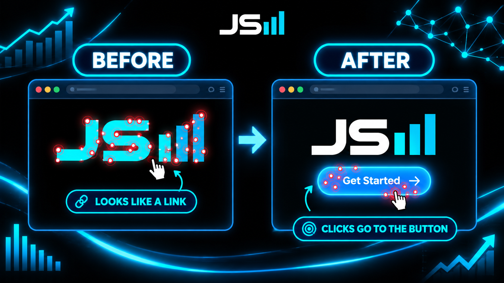
So we're changing the colors. Headlines go neutral. Cyan gets reserved for things that actually respond when you click them, buttons and real links. The brand doesn't change. The brand just stops making promises the page can't keep.
Why the picture wins
My business partner and one of my mentors, Brandon Gosselin, put it to me this way once, and it stuck. People learn differently, and taking in information different ways lights up different parts of the brain. A column of numbers and a picture of the same numbers are not the same input. They don't land in the same place.
I'm a systems guy. I like spreadsheets. I trust them. And I've now watched the same dataset, in two forms, produce two completely different levels of understanding in my own head. The number made me anxious and pointed me at a page. The picture made me calm and pointed me at a fix. That's not a small difference. That's the difference between knowing you have a problem and knowing what to do on Monday.
A spreadsheet is a list of facts. A heat map is a story with a location. Every red cluster is a little scene: here is where a real person, on a real Tuesday, put their finger, and here is what they expected, and here is what they got instead. You can read a scene. You can't read a cell.
If you're running ads, do these three things
- Turn on heat maps before you turn on more spend. Watch where fingers and cursors actually go on your landing page and your booking page. You will find something in the first hour. We found two things in one screenshot.
- Split by device. Mobile and desktop are different animals holding different tools. A finding that's invisible in the blended number can be glaring on one side. Our cyan problem did not exist on phones.
- Design for where attention already is, not where you wish it were. Thumbs live in the top third. Blue-ish text reads as a link. You don't fight those habits. You put the important thing where the habit already lands.
Same honesty as last time: these are the fixes we're shipping this week, and the results aren't in yet. I'd rather show you the process while the paint is wet than a tidy case study six months later with the messy parts sanded off. When the new numbers land, you'll get the sequel to the sequel.
The takeaway
Own your data, sure. I said that last time and I meant it. But owning it isn't the finish line. You have to look at it, and "look" is the operative word. Put it in front of your eyes in a form your brain can read as a story, split it by the things that actually differ, and the bottlenecks stop hiding. Two more found. Target acquired. Fixing now.
Want a website that actually makes the phone ring?
Same offer as always. We build the site, we watch where your visitors actually tap, and you get more calls than your current site is producing, or you don't pay. That's what we do at HyppoAI.
Want to talk about what you're building?
Get in touch